Recruiters don’t read resumes the way you do—they scan them. An eye-tracking writeup reported that recruiters skim resumes for an average of 7.4 seconds on the initial pass. Source: HR Dive (Confidence: High — widely cited and attributed to a Ladders eye-tracking study.)
That “7-second reality” is exactly why fonts and sizes matter:
- If your type is hard to read quickly, humans miss your best points.
- If your formatting causes parsing issues, the ATS may import scrambled data into your candidate profile.
In this guide, you’ll learn:
- The safest ATS-friendly resume fonts (with “why” behind each)
- The best resume font sizes for body text, headings, and your name
- What actually breaks ATS parsing (hint: it’s usually layout, not the font)
- A simple testing checklist to validate your resume before you apply
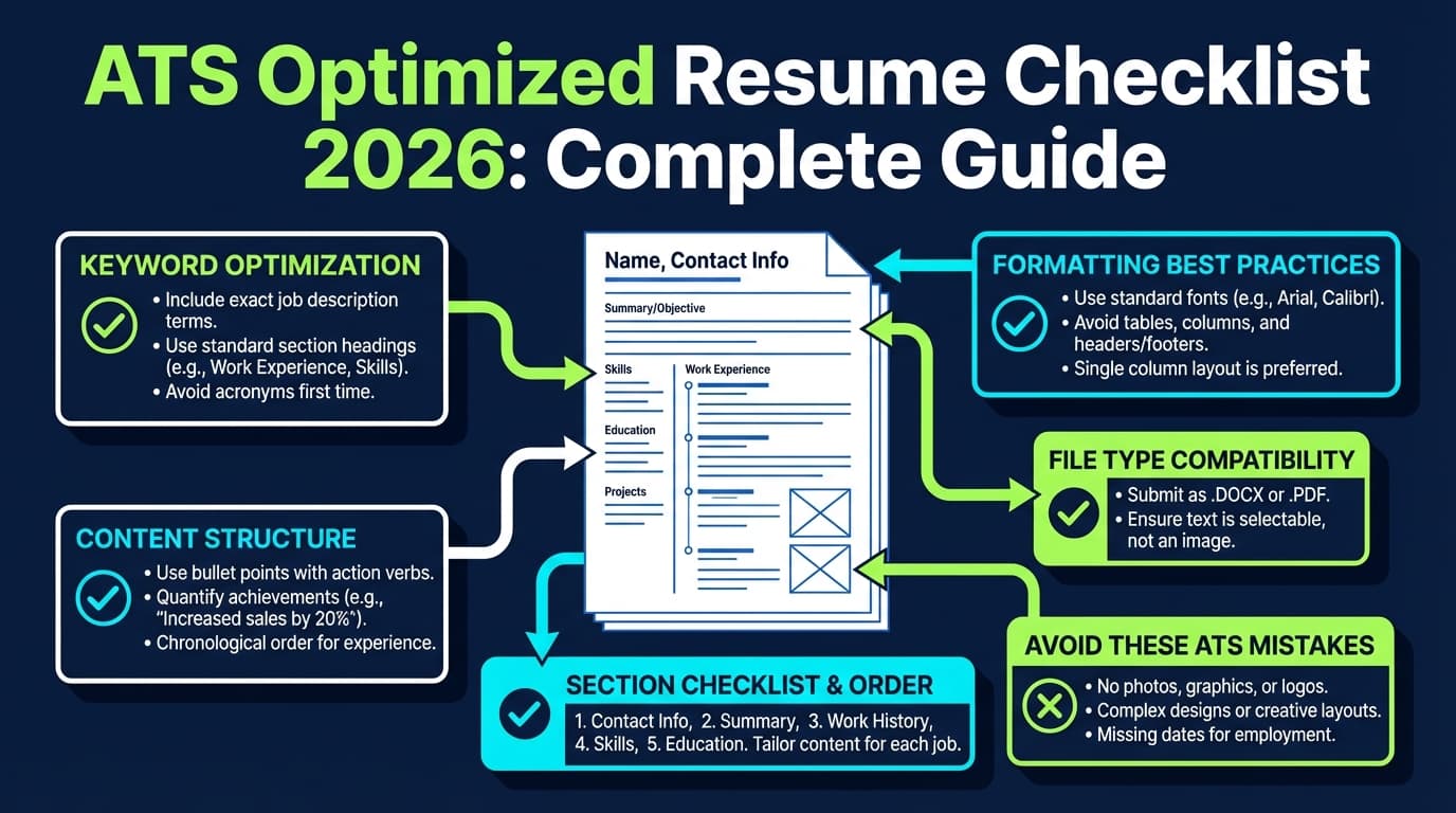
What is an ATS-optimized resume font and size?
An ATS-optimized font is a font that:
- is common (installed on most machines),
- has clear letterforms (good readability),
- exports cleanly to DOCX/PDF, and
- doesn’t cause character substitution (weird bullets, missing glyphs, broken spacing).
An ATS-optimized font size is a size that:
- stays readable during a fast skim (usually 10–12 pt body text),
- creates a clear visual hierarchy (headings larger than body), and
- avoids “cramming” content with tiny text.
Reality check: You don’t “win ATS” with a perfect font. You reduce risk. The biggest wins usually come from keywords, clear headings, and clean structure—but fonts and sizes are part of the foundation.
Why fonts and sizes matter in 2026 (ATS + human screening)
1) ATS usage is widespread
MIT Career Advising notes that about 99% of Fortune 500 companies use some form of ATS. Source: MIT CAPD (Confidence: High — direct guidance from a major university career office.)
Select Software Reviews summarizes ATS adoption patterns, including:
- 70% of large companies use an ATS
- 20% of small and mid-sized businesses use an ATS
Source: SelectSoftwareReviews (Confidence: Medium — credible industry summary; underlying sources vary.)
2) The funnel is tight
CareerPlug reports an applicant-to-interview ratio of 3% in 2024. Source: CareerPlug Recruiting Metrics (Confidence: Medium — strong dataset claim from one publisher.)
When only a small fraction of applicants get interviews, your resume can’t afford avoidable friction like micro-font, low contrast, or confusing hierarchy.
3) Parsing and readability failures are “silent”
If the ATS parses your resume incorrectly, it can:
- drop contact info,
- scramble job titles and dates,
- misread section labels.
Even if you’re qualified, the system (or recruiter) may not see it.
Quick answer: ATS optimized resume best fonts and sizes (recommended defaults)
If you want the simplest, lowest-risk setup:
Best safe default for most job seekers
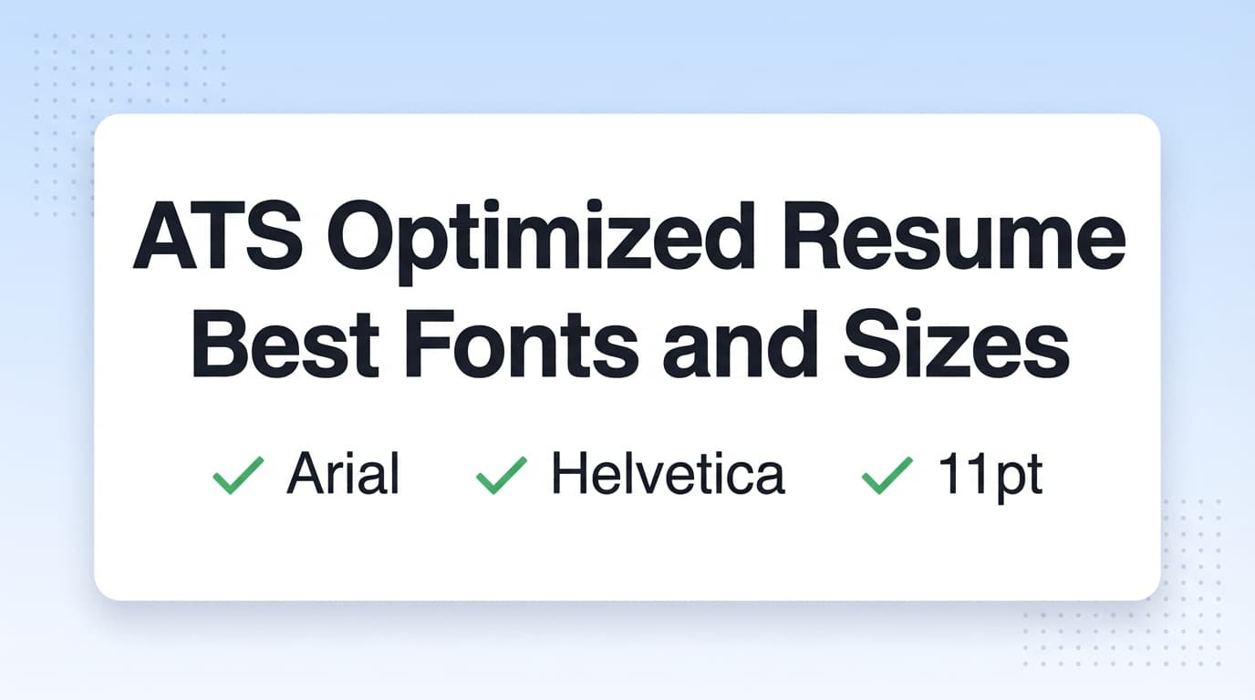
- Font: Calibri, Arial, Cambria, or Georgia
- Body size: 11 pt
- Section headings: 14 pt
- Name: 18–20 pt
Harvard GSAS guidance, for example, recommends sticking to a common font and using font size between 10 and 12 point, kept consistent throughout the document. Source: Harvard GSAS guide (PDF) (Confidence: High).
MIT CAPD also explicitly advises: avoid small fonts and keep fonts at least 10 pt or higher and use fonts common across platforms. Source: MIT CAPD (Confidence: High).
The best ATS-friendly resume fonts (and why)
The “safe” font shortlist (low-risk choices)
These fonts show up repeatedly across resume and ATS guidance because they’re common and readable:
- Calibri
- Arial
- Helvetica (note: not always installed on Windows by default)
- Cambria
- Georgia
- Times New Roman
- Verdana
- Tahoma
- Trebuchet MS
Resume Worded’s ATS font guidance also lists ATS-friendly options like Arial, Calibri, Helvetica, Trebuchet, Avenir, Verdana, Montserrat (among others). Source: Resume Worded (Confidence: Medium — credible resume resource; exact ATS behavior varies.)
Font-by-font recommendations (practical)
1) Calibri (modern, common, compact)
- Best for: general corporate roles, tech, operations, business
- Why: highly readable at 10.5–11 pt, familiar to recruiters
- Best sizes: 11 body, 14 headings
2) Arial (maximum compatibility)
- Best for: conservative industries, government, any ATS-heavy pipeline
- Why: ubiquitous and clean
- Best sizes: 11 body, 14 headings
3) Cambria (professional serif that reads well on screens)
- Best for: finance, consulting, academia-adjacent
- Why: designed for readability, clean hierarchy with bold headings
- Best sizes: 11–12 body (serif can feel denser), 14 headings
4) Georgia (serif that stays readable)
- Best for: a more traditional feel without sacrificing legibility
- Best sizes: 11–12 body, 14 headings
5) Times New Roman (traditional, but watch density)
- Best for: very traditional environments
- Watch out: looks cramped when squeezed
- Best sizes: 12 body if you have space; 11 minimum
Best resume font sizes for ATS + humans (with a simple scale)
Body text: 10–12 pt (11 is the “sweet spot”)
Multiple sources converge on 10–12 pt as a practical range:
- Harvard GSAS (10–12 pt)
- MIT CAPD (avoid small fonts; at least 10 pt)
- SCU Career Center’s ATS formatting notes: body 10–12 and headings 14–16
Source: SCU Career Center (Confidence: Medium — university career guidance referencing ATS formatting norms.)
Recommendation:
- Use 11 pt unless you have a reason not to
- Use 10.5 pt only if your resume still feels breathable
- Avoid going below 10 pt
Headings: 14–16 pt (enough hierarchy without shouting)
A lot of ATS formatting guidance uses:
- Headings 14–16 pt
- Body 10–12 pt
Source: SCU Career Center (Confidence: Medium), and echoed by general resume formatting guides like ZipJob recommending 10–12 for body text. Source: ZipJob (Confidence: Medium).
Recommendation:
- 14 pt section headings is a strong default
- Avoid heading styles that rely on text boxes or graphics
Your name: 18–22 pt (sometimes more)
No single universal standard, but this range is widely used and readable.
ATS parsing myths vs reality: does the font itself matter?
Myth: “If I use the wrong font, ATS will auto-reject me.”
More accurate: ATS rejection is usually driven by:
- knockout questions,
- required skills/experience filters,
- keyword searches,
- recruiter decisions.
Fonts matter mainly when they cause parsing errors or hurt readability.
What actually causes parsing problems more often than font choice?
- Headers/footers (some ATS may not read them reliably)
- Tables, text boxes, and heavy columns
- Icons and unusual symbols
- Image-based PDFs (not selectable text)
UIC’s ATS PDF guide warns against using headers and footers (including contact information) and encourages simple formatting. Source: UIC PDF (Confidence: Medium — career services doc; ATS capabilities vary.)
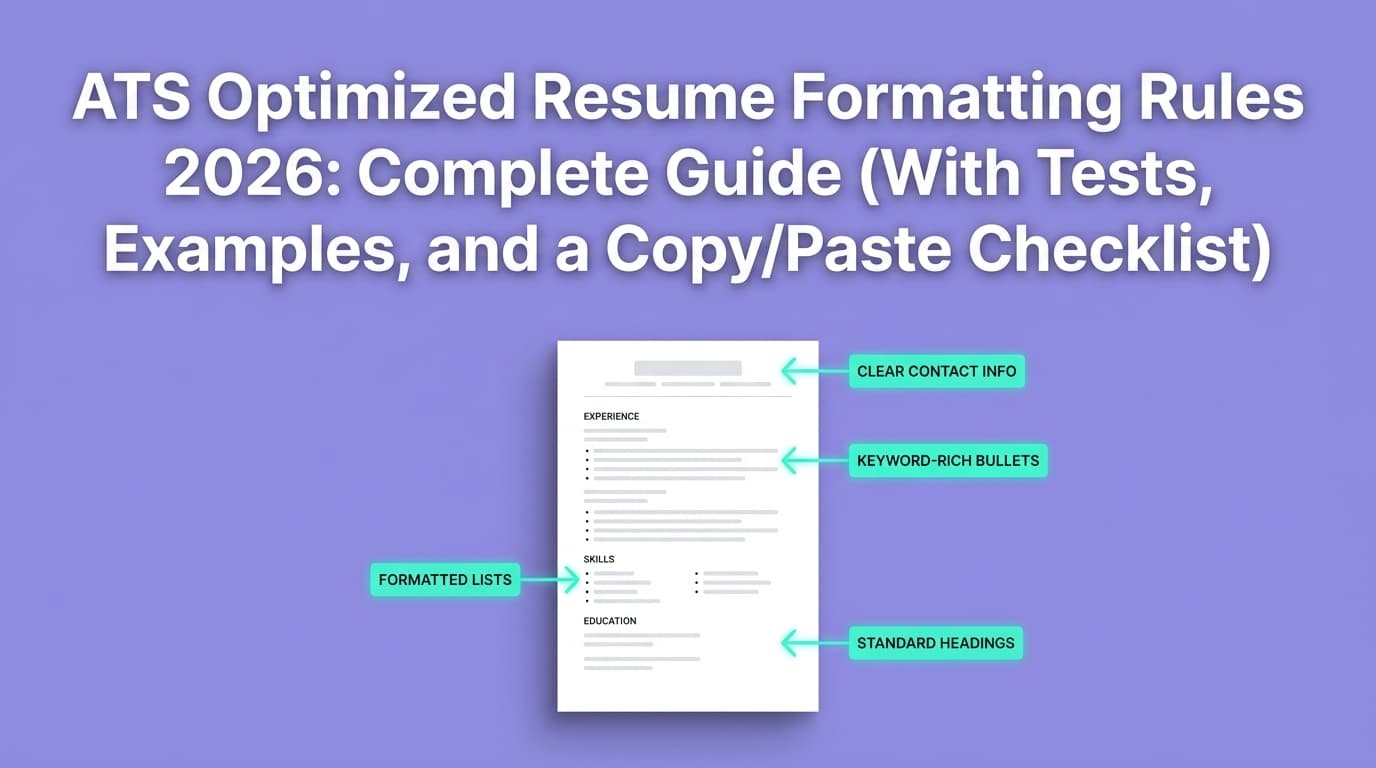
Header/footer issue: where to put contact info so ATS can read it
Some ATS can struggle with headers/footers. Multiple guidance sources recommend placing contact info in the main body at the top.
- UIC recommends not using headers/footers for key info. Source: UIC PDF (Confidence: Medium).
- Similar advice appears in ATS formatting checklists like SCU’s. Source: SCU (Confidence: Medium).
ATS-safe contact block example (plain text):